Position, Velocity, and Acceleration Graphs Lab
Author: Jacob Hoffner
Lab Partners: Andrea Schaefer and Connor Frey
Date: September 2015
Lab Partners: Andrea Schaefer and Connor Frey
Date: September 2015
Purpose
In this lab, we are to uncover the relational construct between graphs of motion and the kinematic equations that describe them.
Theory
|
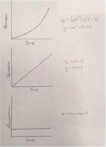
Motion can be described through graphs. These graphs can be represented by Position vs. Time, Velocity vs. Time, and Acceleration vs. Time graphs.
On the right is a sample Position vs. Time graph. The first equation next to it is another explanation of the kinematic equation: 
This kinematic equation has a direct relationship to the quadratic equation right below it to the right. Both equations result in a parabola.
The second sample graph on the right is a Velocity vs. Time graph. The first equation next to this graph is the kinematic equation that relates to it. Below this equation is the slope-intercept equation, y=mx+b, which has a direct relationship to the kinematic equation. The "a" in the kinematic equation is acceleration, which makes sense since it is acting as the "m" in the slope-intercept equation. The third sample graph is an Acceleration vs. Time graph. This graph shows that "a", or acceleration, is constant when relating to time. This lab will prove how all three of these graphs correlate to each other based on velocity and acceleration. |
|
Experimental Technique
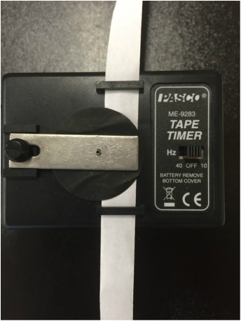
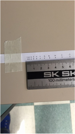
We will be using a cart and an inclined plane to collect data based on the position of the cart and the time it took to get there by marking this data on a paper strip using a ticker timer. Using this data, we will determine the velocity and acceleration using graphs in Excel. The graphs will also be used to find the acceleration and velocity of the cart as the cart's front edge passes the 15 cm and 75 cm mark.
|
|
Data and Analysis
Below are sample calculations that show how velocity and acceleration are calculated into the graphs:

|

|
|
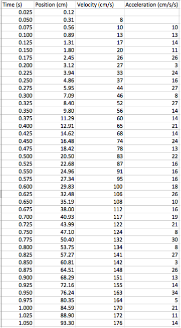
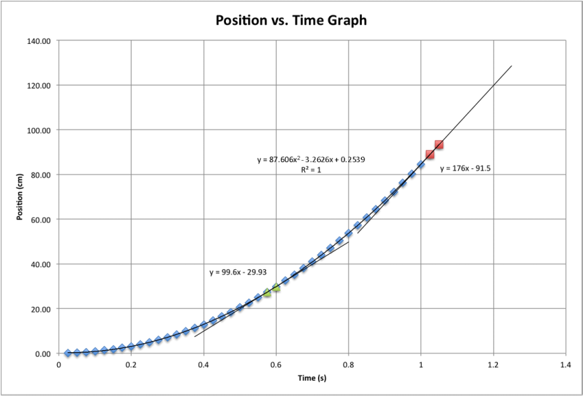
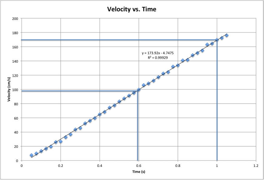
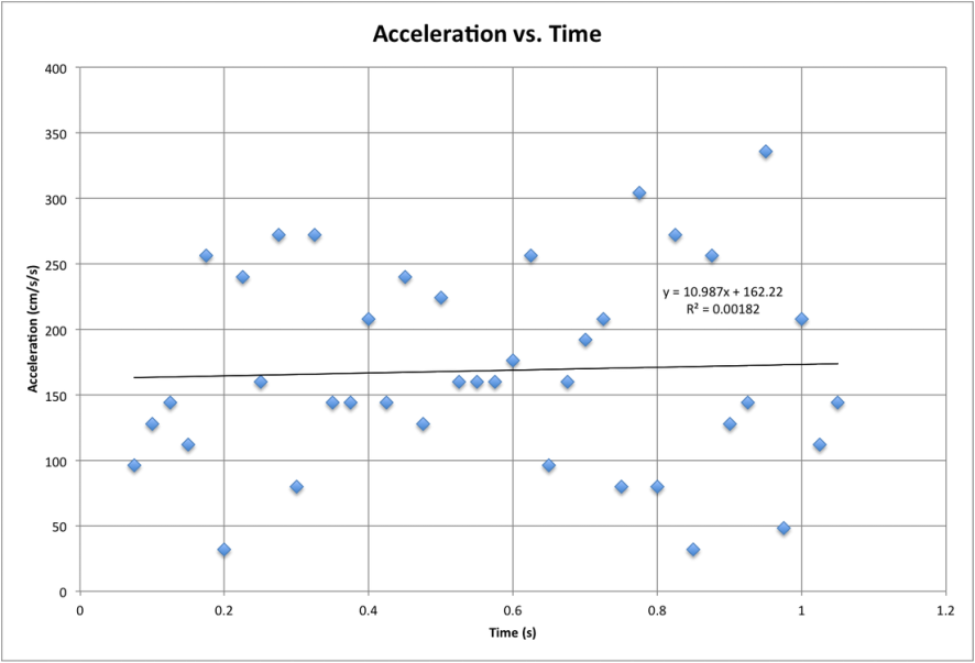
To the right is the PVA Chart that exhibits the data collected and calculated indicating time (s), position (cm), velocity (cm/s), and acceleration (cm/s/s). Below are the graphs used to find velocity and acceleration: Position vs. Time The slopes of the tangent lines in this graph indicate the velocity at the 15 cm and 75 cm marks. These marks are found based on what time the cart passed them. Velocity vs. Time The times on the x-axes are marked where the cart passed the 15 cm and 75 cm marks at that certain time. The corresponding y-value is found with the horizontal line extending from the graphed line. The slope yields acceleration. Acceleration vs. Time. The graphed line indicates the acceleration by referring to the y-value on the y-axes. The velocity of the cart at the 15 cm mark: 100 cm/s
The velocity of the cart at the 75 cm mark: 176 cm/s The acceleration of the cart: 174 cm/s/s These answers are rounded to the nearest significant figure. |
|
Conclusion
The goal of the lab was to find the direct relationship between the Position vs. Time, Velocity vs. Time, and Acceleration vs. Time graphs. Once analyzing the graphs and data, this idea became clear to me. Knowing that the slopes of the the tangent lines in the Position vs. Time graph are the velocities at the 15 cm and 75 cm marks, I can compare these answers to the values of where the horizontal lines meet the y-axes in the Velocity vs. Time graph. The answers to the two velocities match in both of the graphs. The acceleration, or slope, of Velocity vs. Time graph is the same as the y-value, or acceleration, of the Acceleration vs. Time graph. Therefore, since the graphs yield the same answers to velocity and acceleration, the kinematic equations share a direct relationship to the graphs of motion, which proves the theory. The following are other questions that were considered, and now have a concluding answer. In theory, the acceleration should be constant, however there was a slight variation in the acceleration in the graphs. Even though the average acceleration was proven to be 174 cm/s/s, there was a slight shift in acceleration in both the Velocity vs. Time and the Acceleration vs. Time graphs. Nothing in this world is 100% efficient, and this is due to friction. Yes, friction does affect the outcome of this lab due to wind resistance and gravity, however the effects of it are so minuscule that they are not obvious within the data of this lab. The Position vs. Time graph has a smooth correlation coefficient, while the Velocity vs. Time graph is not as smooth. How I see it, the measurements I found for the position of the cart when relating to time are slightly inaccurate due to the uncertainty of human error. This cannot be seen in the Position vs. Time graph, however the magnitude of these errors becomes larger (and numbers are rounded due to significant figures) when finding velocity for the Velocity vs. Time graph. The Acceleration vs. Time graph presents these issues very well, as it is very "noisy". In this case, instantaneous acceleration is found for each change in velocity, so the Acceleration vs. Time graph indicates all of these changes and finds the line of best fit. Overall, there is a clear understanding between the kinematic equations and the graphs of motion.
References
http://lahsphysics.weebly.com/pva-graphs-lab.html
Physic Textbook: Physics: Principles with Applications (Fifth Edition) ~ By: Douglas C. Giancoli
Physic Textbook: Physics: Principles with Applications (Fifth Edition) ~ By: Douglas C. Giancoli
